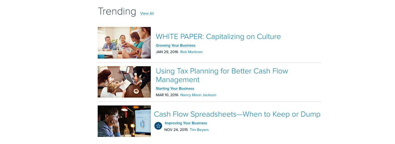
Supporting Small Businesses
This project included a complete content audit, redesign of the website, and a new content strategy that would add value for small business customers.
I worked with designers and a UX team to structure wire frames, decide new content categories, and reframe existing content on the website to create an improved experience. See the full breakdown below.


Breaking Down the Process
Content Audit
This website redesign was content focused from Day 1. We had a bank of content that existed on the previous site, but it wasn’t categorized and there were no cohesive themes. So before design even got to this I:
Did a complete content audit (and read hundreds of pieces)
Developed categories based on existing materials (I named these start, grow, and improve)
Edited and updated several pieces to make sure they aligned with my new categories
Wireframes
I like to sketch my ideas out first, from a content perspective, so I created wireframes that explored how I might feature my selected categories. I decided that it would be smart to make my new categories leading navigation items. I also knew I wanted:
A space for trending news (as a content writer I know how crucial this space is, but it’s also material that is most relevant to our audience outside of my selected categories)
A navigable section at the bottom at the bottom that would help the audience explore the categories deeper without having to click on just one
Side note: Picking actionable words is one of my favorite things to do, but it was especially important here because I thought it would appeal to the entrepreneurial spirit of our audience. Start, grow, and improve are all things you want to constantly be doing as a small business person so I find them inclusive—I knew at least one of these things was going to apply to someone on our site.
UX Design
I handed my sketches over to the UX designer, who then created wireframes based off my inspiration. He developed three different experiences to share with the team for concept validation and after, we worked through feedback together to improve both of our initial ideas.
Digital Design
With wireframes in hand, the digital designer took over. There was a lot of back and forth here with getting the right style. I also started writing website copy and both of us had to follow some pretty specific brand guidelines. Again, we finished with 3 designs to share with the team.
Web Development
At this point, we moved from a proprietary project management software to Asana so we could connect with our web developer. The develop took our final concept and created a first draft of the site. There were many, many drafts
User Testing
Of course, no website is ever complete. Before it’s official launch I was charged with testing for accessibility and writing meta descriptions. We also used heat mapping during a soft launch to make small tweaks and improve the social interaction.
Side note: If I could improve something today, I would advocate more strongly for a simpler navigation. I believe it could read “Starting, Growing, Improving, Trends & Insight, and About.” Adding “your business” to the end seems redundant. I also feel there could be a stronger differentiator between “growing” and “improving.”


